The 7 Principles of Design: A Guide to Creating Visual Harmony
Whether you’re designing a logo, a poster, or a full website, great design is never an accident. It’s the result of applying certain core principles that guide how elements work together to create balance, clarity, and visual appeal. These principles help designers make intentional decisions and ensure their work connects with viewers. Here are the 7 principles of design and how you can apply them to your own creative projects.
1. Balance
Balance refers to the visual weight of elements in a composition. It’s about distributing design components so no one part feels heavier than another.
Symmetrical balance: Equal elements on each side of the design, giving a formal and organized feel.
Asymmetrical balance: Different elements with equal visual weight, often more dynamic and interesting.
In web design, balance ensures your layout feels stable and easy to navigate.
2. Contrast
Contrast highlights differences between elements, making certain parts stand out. This can be achieved through variations in color, size, shape, texture, or typography.
Use dark text on a light background (or vice versa) for readability.
Pair bold fonts with lighter weights to create hierarchy.
Strong contrast helps guide the viewer’s attention and improves accessibility.
3. Emphasis
Emphasis ensures the most important information gets noticed first. Designers often use size, color, position, or typography to create focal points.
A bold headline on a landing page draws the eye.
A brightly colored call-to-action button encourages clicks.
Without emphasis, designs can feel flat and directionless.
4. Movement
Movement is the path the viewer’s eye follows across the design. This can be intentional—guiding users through content—or unintentional, which can lead to confusion.
Use directional lines, arrows, or imagery that subtly “point” to key areas.
Arrange elements in a logical visual flow (top-to-bottom, left-to-right for most languages).
In digital design, movement can also be enhanced through animation or scrolling effects.
5. Proportion
Proportion relates to the size relationship between elements. Good proportion ensures that no part of the design feels out of place or distracting.
Keep headings larger than body text for readability.
Ensure images scale well with surrounding content.
Balanced proportions create a sense of harmony and professionalism.
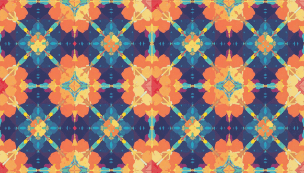
6. Repetition
Repetition reinforces consistency and builds familiarity. This could mean repeating colors, shapes, patterns, or fonts throughout your design.
Use a consistent color palette across your website.
Repeat button styles for predictable user interaction.
Repetition creates a unified experience and strengthens brand identity.
7. Unity
Unity ties all the other principles together, ensuring every element feels like part of a single, cohesive design.
Align elements to a grid system.
Keep the tone, style, and branding consistent.
When unity is present, the design feels complete, and nothing seems random or disconnected.
Final Thoughts
Mastering the 7 principles of design is essential for anyone looking to create impactful visuals—whether you’re crafting a minimalist website, a vibrant social media graphic, or a complex mobile app interface. While creativity has no strict rules, these principles act as a compass, helping you make purposeful choices that resonate with your audience.
Tip: Next time you design, pick one principle to focus on improving—you’ll see your work evolve with every project.